NextGen 2023 User Interface guide
Starting with version 2023, NextGen has a different user interface than in the past. This article explains the main differences compared to previous versions, so as to support users in the migration phase between one version and another.
Why has the NextGen UI changed?
The main purpose that we have set ourselves with this change is to make it easier to discover functions available in the program, which in some contexts were hidden. In addition, the behavior and appearance are more in line with programs users are used to, such as the Microsoft Office suite.
Main differences
There are two substantial differences between the previous versions and the model introduced with the 2023 version:
Previously, there was a "container" window that housed all other NextGen windows (including the design windows and reports). Now each window is independent and can be recalled from the Windows taskbar.
Previously, some features were stored in menus, others accessible via buttons. Now there is a toolbar (named "ribbon bar") that groups all these features in the form of buttons.
Let's now see the differences in more detail.
Starting the program
As mentioned, up to version 2022.3, when the program was started two windows were shown: one in the foreground, called "Projects Browser", which allowed you to explore and manage your calculations. A second window in the background had the function of containing the NextGen work windows.
It was possible to close the "Projects Browser" and access some functions, even without having opened any item: for example, it was possible to access the materials database, set the options, or send a request for assistance.
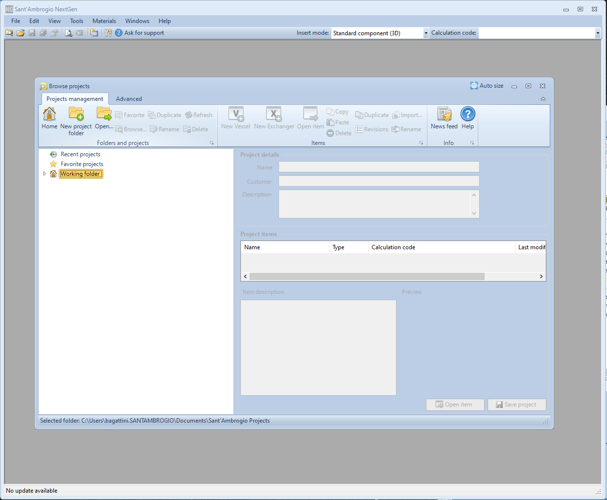
The look of NextGen after being just launched in version 2022.3
Starting from version 2023, NextGen shows only the "Projects Browser" window at startup. In addition to the file management features previously present and detailed in this article some buttons have been added that allow, among other things, to:
Set program options
Ask for support
Open material databases
Search for and install updates
Access diagnostic functions
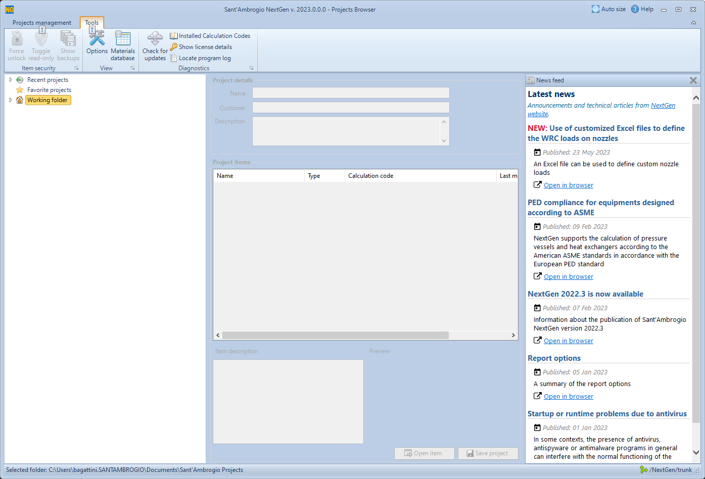
The look of NextGen after being just launched in version 2023
Command reorganization
In previous versions, the commands for creating components, reports, managing the program and managing the item were organized on 3 levels:
Upper text menu (File, Edit, View, etc)
Toolbar with small icons (file saving, item properties, "Ask for support", etc)
Toolbar with large icons (insertion of cylinders, bottoms, etc)
The different areas covered different tasks: with reference to the following picture:
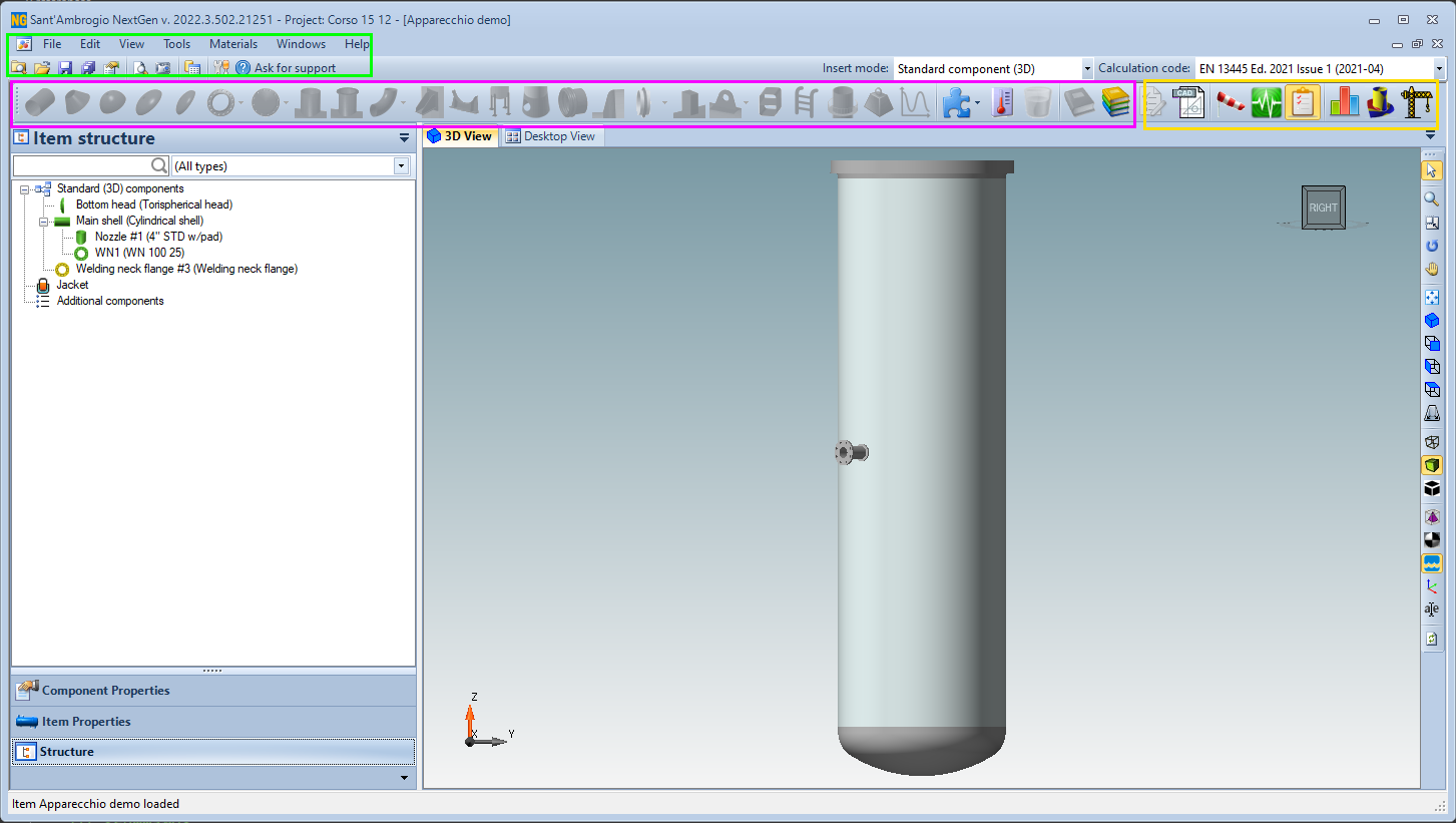
Designer appearance in NextGen 2022.3
The area highlighted in green contained commands for managing the file and for accessing features that concerned the entire program
The area highlighted in fuchsia contained the commands for inserting components into the current item
The area highlighted in yellow contained commands for managing some advanced features
In NextGen 2023 and later, there is a single toolbar. Through the tabs located in the upper part it is possible to choose the macro-area of the desired command. These macro-areas, or categories, are:
File, for managing saving, opening, revisions, properties related to the current file
Components, for inserting and printing components
Item, for managing properties relating to the entire current item
View, to change the current view and view databases of standard materials and components
Tools, for accessing tools such as software options, export, quick replacement of materials and gaskets
Help, for help and diagnostic functions
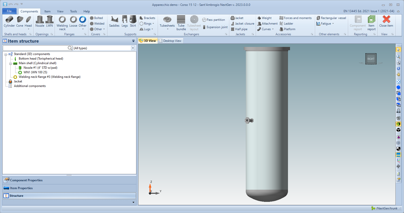
Designer appearance in NextGen 2023
Contextual category
When a component is selected, an additional category, contextual to that component, appears on the ribbon.
Through these commands it is possible to interact with the component itself, modifying its appearance or carrying out operations such as the conversion, replication or insertion of intermediate components.
The same operations are available by clicking with the right mouse button on the component itself or its icon in the hierarchical tree view.
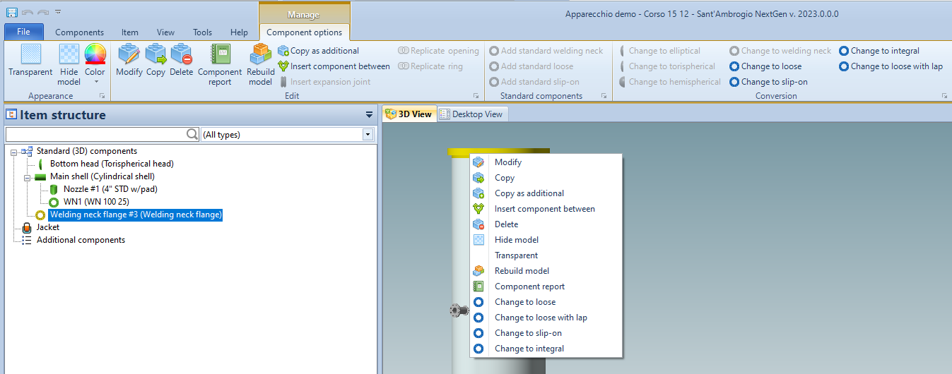
The contextual menu and toolbar
Enabled and disabled component insertion commands
The NextGen input commands have always been activated and deactivated according to the current selection. For example, if a cylinder is selected, the icons relating to the components that can be connected to that cylinder will be active and highlighted in blue. A red icon will instead identify a component for which you do not have the relevant license. Finally, the remaining grayed-out icons indicate components that cannot be added at a given time.
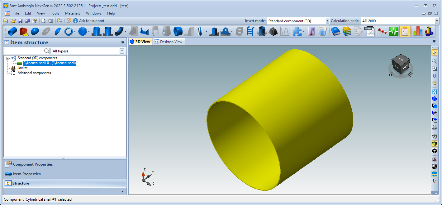
NextGen 2022.3 component input bar
Version 2023 introduces some improvements in this area. The previous convention is maintained, therefore when a component is selected we will still have the icons in blue for the components that we can pair with the selected one and the icons of the unlicensed components in red.
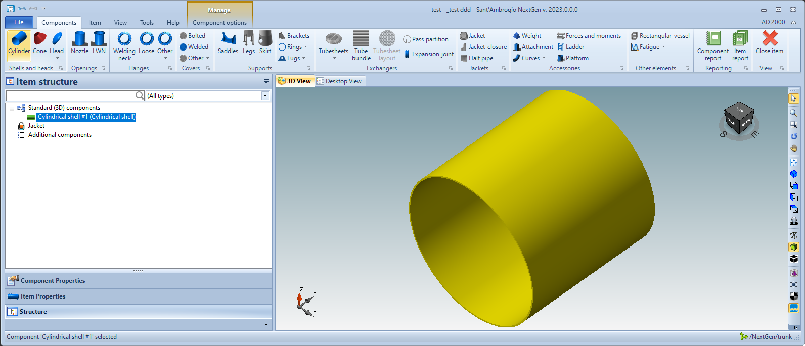
NextGen 2023 component insertion bar
The novelty lies in the fact that now, by hovering the mouse cursor over a button that is disabled or with a red icon, the program will communicate the reason why this function is inhibited.
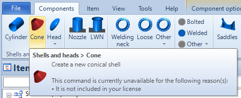
Command disabled due to lack of license
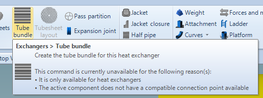
Command disabled as it cannot be connected to the current component and is only available when the current item is a heat exchanger
For commands included in sub-menus, simply click on the command itself to access information about why it is disabled.
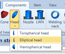
Elliptical heads are not available in this context
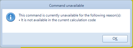
By clicking on the elliptical haed input command, we are informed that elliptical heads are not supported by the current calculation code, AD 2000
Quick functions
Some frequently used features present within sub-menus and program windows are now available directly on the ribbon. For example, you can quickly set the orientation of the device or the jacket support.

Some quick functions
These functions may be extended in the future, in order to speed up the operation of commonly used functions.
Calculation report
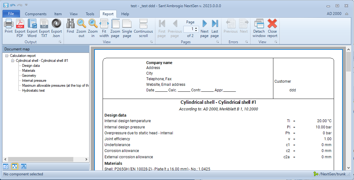
Creating the calculation report of a component or the entire device brings up a new tab on the ribbon. It will then be possible to switch from the design to the last report generated by alternating between the various sections. If you want a behavior more similar to previous versions of NextGen, the "Detach window" button is available to move the calculation report to a separate window.
Final words
We're aware that a change in the user interface requires long-time users to re-learn a part of the program. We did our best to change NextGen to make it more usable and to give some hidden features the visibility they deserve. While transitioning from the old interface, keep in mind that you can always use NextGen 2022, as the new version is installed side-by-side. If you're missing a something, please contact us via "Ask for support" and we'll be glad to help you.